Designing a Regimen
Ordering & Management Systems
Regimen Management
-

1. Lifecycle Flexibility, Safety, and Scaling
My role on the UX team was to redesign the Regimen Management experience within our oncology treatment planning suite. The goal was to replace fragmented, outdated workflows with a unified, intuitive interface that supports clinical decision-making across the entire treatment lifecycle.
From the moment a plan is selected providers should be able to make adjustments and audit changes. I focused on creating a workflow that is
Safe - By guiding providers
Intuitive - Providers know what to do without instructions
Efficient - Providers need minimum effort to do the job
whether the regimen includes a single item or is a complex and multi-phased treatment plan. -

2. Design Goals
The core objective was to design the most comprehensive and intuitive regimen management view in the oncology market. A solution capable of supporting:
Both simple and highly complex regimens
Large volumes of medications across multiple treatment cycles
Flexible adjustments and thorough documentation
A unified view that combines editing, historical context, and future planning
This vision was shaped by several key drivers:
Ongoing user complaints about the limitations of current tools
Multiple prior redesign attempts that failed to meet clinical needs
A strategic push to future-proof our solution in a competitive and evolving market
-

3. Tools and Collaboration
Tools used throughout the process:
Figma – Primary tool for design and interactive prototyping
Miro – Used for mapping user journeys, affinity diagrams, and collaborative workshops
Confluence, Jira, Trello – For documentation, ticket tracking, and feedback loops
Google Suite – Used Forms and Meet for stakeholder interviews and collaborative planning
Google AI tools – Supported clustering, data synthesis, and pattern analysis during research
Collaborated closely with:
Fellow UX designers
Product owners
Oncology and pharmacy subject matter experts
Engineering and service implementation teams
-

4. SWOT Analysis
Strengths
Supported basic regimen customization
Core functionality worked well for simple treatment plans
Weaknesses
Edits did not sync between ONC and Pharmacy modules
Limited to 12 treatment cycles
Navigation across views was fragmented and confusing
Scheduling and authorization logic was inconsistent across sites
Opportunities
Redesign the experience with flexible, future-proof building blocks
Standardize workflows across departments and facilities
Improve usability to better support clinicians and differentiate in the market
Threats
High workflow complexity and clinical risk
Requires tight cross-functional coordination
Risk of scope creep due to varied stakeholder needs
-

5. Designing for Multiple Personas
We designed the experience to support a diverse group of clinical and operational users, each with unique goals and responsibilities:
Oncologists and Advanced Practice Providers – Need speed and confidence when managing active regimens
Nurses – Require clear, accurate instructions to ensure safe and timely medication administration
Pharmacists – Depend on logical consistency and editable, audit-ready data
Schedulers and Billing Teams – Rely on accurate timelines and treatment statuses for downstream workflows
Medication Authorization Staff – Need clear documentation and the ability to track changes for insurance approvals
Each persona required access to different layers of detail, often at different points in the workflow. Balancing these needs in a single, unified interface was one of the core challenges of the UI design.
-

6. User Journeys
Before
In the original workflow, providers placed orders within the treatment plan, which were then sent to Pharmacy through a fragmented and manual handoff process. If any edits were required after signing, providers often had to cancel the entire plan or create multiple disconnected versions to reflect changes. This made it difficult to maintain a clear audit trail and often left teams unsure about what was originally intended versus what was actually delivered.
Clinicians expressed hesitation and frustration.
“I don’t know if changing this will break the whole regimen.”
After
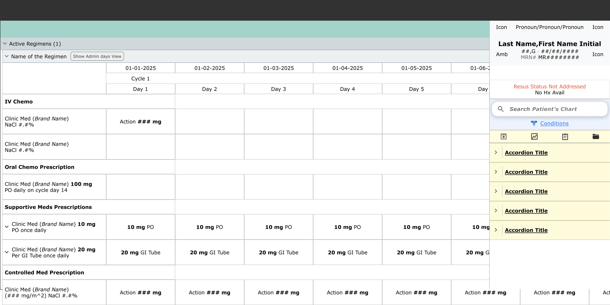
With the redesigned workflow, providers can now manage doses and cycles in real time with full transparency. Changes are automatically synced to Pharmacy through a unified data structure, eliminating confusion and reducing the risk of error. A visual timeline clearly separates upcoming and historical cycles, making it easier to track treatment progression.
Every adjustment is versioned, scoped to a specific cycle or day, and fully auditable—preserving both intent and execution.
Clinicians now feel empowered and in control.
“I know what I changed, what it impacts, and what comes next.”
-

7. Heuristic Evaluation
The legacy system violated several core usability heuristics, leading to confusion, inefficiency, and risk:
Lack of visibility into system status
Users could not easily distinguish between current, upcoming, and past treatment states, creating uncertainty about what was happening and when.Mismatch between system behavior and real-world expectations
The interface did not reflect the mental models clinicians used to understand treatment logic, making it harder to interpret regimen structure and intent.Inconsistency across user roles
Different users saw different versions of the regimen, depending on where they accessed it. This led to miscommunication and fragmented collaboration.Overly dense interface with poor readability
Text-heavy screens lacked visual hierarchy and spacing, making it difficult to scan or focus. Important information was buried in undifferentiated blocks of content.Accessibility shortcomings
Color contrast issues, lack of responsiveness, and poor readability in dark or light modes all made the interface difficult to use for a wide range of users, including those with accessibility needs. -
8. Problem Statement & Value Proposition
Clinicians lacked a unified, flexible, and trustworthy way to manage signed treatment regimens across their full lifecycle. Existing tools were fragmented across modules, prone to errors, and difficult to navigate. As a result, providers hesitated to make changes, risking delays in care and breakdowns in communication between teams.
The Value Proposition
We set out to create a single, cohesive regimen management experience that is:
Intuitive and scalable across simple and complex treatment plans
Clinically aligned with the workflows and mental models of oncology teams
Strategically differentiated from competitor solutions in the EHR space
This new experience supports safe, real-time changes, provides visual clarity across the full timeline of care, and preserves treatment continuity—positioning our product for long-term success in a highly competitive market.
-
9. User Research and Insight Synthesis
I conducted interviews with nine key internal stakeholders, also external users like oncologists, pharmacists, nurses, and QA reviewers. The goal was to understand how users interact with regimens throughout their lifecycle and where existing tools were falling short.
Key insights:
Users needed the ability to adjust individual cycles or full treatment plans without restarting the order process
Changes to dose timing, substitutions, or scheduling had to be both traceable and reversible
The distinction between “draft” and “active” regimens was unclear, leading to miscommunication and risk
To synthesize findings, I created an affinity map in Miro and grouped feedback into key categories:
Edit intent (cycle-level, dose-level, schedule-level)
Safety concerns and audit traceability
Timeline clarity and navigation
UI visual hierarchy and scanability
Documentation and communication gaps
These themes directly shaped our feature prioritization process, using a complexity vs. impact matrix to guide what we tackled first.
-
10. Ideation | Exploration | Strategy
We explored three early interaction models to support complex regimen workflows:
Tabbed views for Edit, History, and Future
Accordion layout grouped by cycle
Scrollable matrix for full treatment visibility
After testing and evaluation, we selected an infinite scroll + fixed column layout. This approach struck the right balance between longitudinal tracking, edit accessibility, and scannability of day-level data across cycles.
Key design elements included:
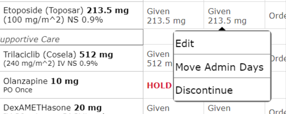
Inline edit icons for quick, role-appropriate access
A toggle for “Edit this cycle only” vs. “Edit future cycles”
Visual indicators showing modified doses versus signed, finalized orders
A persistent sidebar summary displaying cycle duration, start date, and key notes
This layout allowed us to surface complexity without overwhelming the user, while also supporting real-time updates and high-risk clinical decision-making.
-

11. Design System Integration
I followed Meditech’s evolving design system standards for spacing, typography, and component usage to ensure visual consistency and accessibility.
Beyond applying existing guidelines, I actively contributed to the system by helping shape:
Data table behaviors for clinical records
Pill tag components for labeling dose types, statuses, and scopes
Scroll and fixed-column patterns for timeline navigation
I also built on proven industry patterns for managing longitudinal timelines, filter logic, and responsive layout structures. These design contributions are now being reused across other product areas, reinforcing consistency and accelerating future development.
-
12. Iterative Design | A/B Testing
We compared paginated layouts with infinite scroll. Infinite scroll consistently tested better for user orientation and continuity, especially when reviewing multiple cycles across complex regimens.
User testing included:
Internal service and pharmacy teams
Oncology nurses and prescribing physicians
Feedback highlights:
“It feels like one place now.” — referring to the integration of editing, history, and future planning into a single view
“Love seeing more info in the first column — that’s what we actually care about.” — reinforcing the value of prioritizing key treatment details
Design adjustments based on feedback:
Pulled critical information leftward for faster scanning
Collapsed rarely used fields to reduce visual clutter
Introduced color-coding for cycle mismatches and skipped days
The design has gone through more than 10 major iterations and continues to evolve.
Recent improvements include:
Adding timeline markers to improve orientation
Testing a new edit modal flow for dose changes
Building a preview-before-save interaction to support safer decision-making
-

13. What’s Next?
To continue improving flexibility and safety across the full treatment lifecycle, we plan to expand Regimen Management with several key enhancements:
Edit Timeline Tool
A visual drag-and-drop scheduler to adjust treatment days and sequence with easeIntegrated Labs and Non-Med Orders
Support for managing labs, diagnostics, and supportive care alongside medication ordersAlternating and Loading-Dose Cycles
Enhanced cycle logic to support more complex, protocol-driven regimensAuthorization Workflow Tracking
Visibility into insurance and authorization status tied directly to regimen updatesBilling Enhancements and Insurance Sync
Improved alignment between clinical documentation and billing requirements for accuracy and efficiencyThese additions are grounded in ongoing user feedback and will further solidify Regimen Management as a scalable, end-to-end solution for oncology care.
-

14. Reflections
Designed for real-world messiness
"No regimen goes perfectly. This project taught me how to design for complexity, variability, and the unexpected by creating a flexible, fail-safe experience for longitudinal care."
Connected the dots across roles
"UX means more than identifying conflicting needs. It means aligning them. I helped establish a shared language for change across disciplines."
Designed the system, not just the screen
"Every edit touches scheduling, pharmacy, billing, and documentation. My work bridged these invisible boundaries to ensure the system worked holistically and not just visually."
Preview a Regimen
-

1. Goal
Clarifying ambiguity, aligning cross-functional teams, and designing a safe, intuitive solution for previewing complex oncology regimens.
-

2. Transforming the Regimen Preview Experience
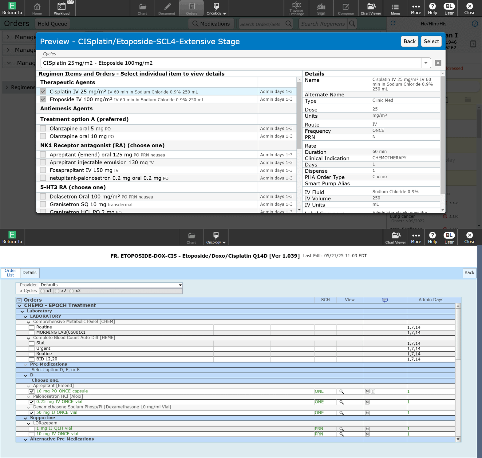
One seemingly simple part of ordering a regimen, which is a large set of coordinated orders, is the ability to preview its contents without taking action.
At first glance, this might not seem important. But in practice, this step plays a critical role in clinician confidence and patient safety, especially in high-risk oncology workflows.
I led the design effort for this initiative within our ONC-certified EHR. My responsibilities included conducting user research, creating wireframes, running validation tests, and iterating based on feedback. The core challenge was to design a safe and intuitive preview experience that could support a wide range of users with different needs, all working together in real time.
The project lasted several months and brought together a broad group of stakeholders. These included internal product owners, implementation and service teams, standard content and tools groups, oncology IT, oncologists, pharmacists, nurses, compliance experts from government organizations like the NCI, private healthcare alliances such as the NCCN, and our internal accessibility team.
-
3. The Problem: Inconsistent, Unsafe, and Fragmented Preview Experiences
My initial research uncovered some uncomfortable truths.
Preview tools were either missing, misleading, or unsafe, depending on where in the system they appeared. Users in different roles such as oncologists, pharmacists, and nurses had varying expectations of what "Preview" should show, leading to confusion and miscommunication across teams.
There was no shared mental model. Each group relied on its own version of preview, making it difficult to collaborate or align on what was actually being ordered. Even worse, critical updates to the regimen were not reflected in real time, which only increased the risk of error.
This was not just a design gap. It was a safety and clarity gap.
Providers had no consistent, reliable way to validate high-risk orders before moving forward with treatment. As a result, this added clinical risk and slowed down decision-making at some of the most crucial moments in care.
-

4. Starting from Ambiguity: What Do Users Need to See?
How did we approach the ambiguity?
To understand the problem deeply, I began with stakeholder interviews across oncology, pharmacy, and nursing. These conversations helped uncover how each role thought about the concept of “Preview” and what they expected to see.
I led collaborative whiteboarding sessions to visualize mental models and map out both conflicting and overlapping expectations. Rather than jumping straight into mockups, I focused on clarifying what users actually needed preview to communicate.
Key research insights included:
“I want to see what’s in the dictionary and what the oncologist sees when they order it.”
“I need to know which meds are grouped together and which fluids are running at specific rates.”
These insights revealed major gaps in shared understanding and preview needs across teams. Taking the time to map these out gave us a clear foundation for the final design and aligned everyone on what preview needed to do and for whom.
-
5. Design Principles: Safety, Clarity, and Efficiency
I narrowed our research findings into a set of guiding principles to keep design decisions grounded and consistent. These principles helped us navigate key tradeoffs, such as balancing usability with accessibility.
Design principles:
Create one clear source of truth for all users
Adapt to the specific needs of each user group
Leverage existing tools to reduce development effort
Align with industry standards and accessibility guidelines
Present a clear information hierarchy
Avoid visual overload and cognitive fatigue
These principles became a touchstone throughout the design process and helped ensure the final solution was not only functional, but trusted by everyone using it.
-

6. Design Exploration: From Low-Fidelity to Structured Clarity
Early failures: What didn’t work
Early versions of the design surfaced several issues that made the experience confusing, overwhelming, or outright unusable for key user groups.
No accessibility support, which excluded screen reader users and violated core design principles
Standard tools were too rigid and couldn’t adapt to complex oncology workflows
Layout constraints from proprietary code made content hard to structure clearly
The combination of accordions with radio buttons caused users to miss critical details
Grouping medications by cycle felt unintuitive and disjointed
Information was presented in a flat layout that made it difficult to separate medications from their associated details
Pre-expanded or collapsed views for active days only didn’t align with user expectations
Again, zero accessibility, which we could not ignore
Early versions also leaned too heavily on technical assumptions. Many users got lost in the complexity. Through testing and iteration, I shifted toward progressive disclosure and context-aware expansions, helping users focus only on what was relevant to them at the right time.
-
7. Validation & Feedback: Testing With Clinicians and Pharmacists
During usability sessions, we discovered that users did not realize the design was trying to support multiple workflows at once. Each role such as pharmacists, oncologists, and nurses viewed the experience through their own lens and had little concern for the needs of others.
This was a turning point. We realized the preview experience had to adapt based on who was using it and where they were in the workflow when they clicked "Preview."
Pharmacists, for example, needed clear breakdowns of fluid volumes and additive details. Oncologists preferred streamlined summaries that emphasized treatment intent by day. In response, I pivoted the design toward a layered information hierarchy that could flex based on role and context. This shift allowed us to serve different needs without overwhelming any one user group.
-

8. Impact & Outcomes: Results: Safer, Faster, More Confident Orders
What changed after implementation
The new preview experience had a noticeable impact across teams:
Increased clinician confidence before signing
Fewer pharmacist clarification requests
Improved alignment between specialties
The redesigned preview is now a core part of the ordering workflow. It reduces friction, supports cross-functional coordination, and improves the safety of high-risk treatments. Other product teams have started exploring how this view could serve as a launch point for additional workflows.
What’s next
We are continuing to evolve the experience by refining the information hierarchy to support expanding data sets and adapting the preview workflow for pediatric oncology use cases.
-
9. Reflection & Leadership: What I Learned as a Lead Designer
Leading Through Ambiguity
There was no clear definition of what a regimen preview should include. Each user group—oncologists, pharmacists, nurses—had different needs and mental models.
I took the initiative to conduct foundational research and shape a shared vision for the feature. This meant leading discussions, surfacing tensions, and using UX as a bridge between perspectives.
Creating Alignment Across Roles
This project taught me how to create clarity across domains, even when stakeholders had different goals and vocabularies.
I learned to listen for nuance. For example, what a pharmacist calls "volume accuracy" may mean something very different to a nurse.
I held regular meetings with subject matter experts to ensure we were balancing needs fairly, without prioritizing one role over others. I became a translator between clinical languages, making sure the UI communicated clearly to everyone.
Balancing Detail with Usability
Early prototypes were dense. They technically displayed everything, but with little hierarchy. Users were overwhelmed, not informed.
I learned that being comprehensive is not the same as being clear.
I shifted toward progressive disclosure and contextual logic. Instead of removing content, I reorganized it so that users could focus on what mattered most at the right time.
Owning Outcomes, Not Just Designs
I stayed with this feature from early concept through usability testing, pilot implementation, and integration with other active development teams.
I worked closely with developers and clinical advisors to make sure the final output matched the design intent. After launch, I plan to gather feedback, support adoption, and help shape future improvements.
Ownership does not end at design handoff. It continues through outcomes, adoption, and iteration.
Reflection
This project pushed me beyond design execution and into systems thinking. I gained a deeper understanding of how clarity supports clinical safety, and I saw firsthand that trust is built not just through pixels, but through alignment, leadership, and the ability to navigate competing truths.
Ordering a Regimen
-

1. Designing a Safer, Smarter Way to Order Oncology Regimens
This case focuses on the clinical ordering experience within oncology treatment planning. My role as the lead designer involved untangling deeply technical logic and clinical safety constraints into a usable interface that supports accuracy and trust in high-risk medication workflows.
Project type
Medication ordering experience within oncology treatment plansMy role
UX designer responsible for end-to-end design including research, co-design sessions, usability testing, iterative refinement, and continued involvement through delivery and adoptionStakeholders
This was a large, cross-functional effort involving product owners across applications, collaborating designers, front-end and back-end development teams, third-party vendors, internal service and implementation teams, standard content creators, standard tools teams, clinical informatics, pharmacists, oncologists, nurses, advanced practice providers, billing and accounts, scheduling, insurance and authorization teams, the accessibility team, and internal UX and development teamsTimeframe
2022 to 2025
This is the most safety-critical touch-point in the workflow where a provider commits to a plan. It has to be clear, fail-safe, and flexible enough to support highly complex regimens. -

2. The Challenge: The Problem: Fragmented, Risk-Prone Workflows
The challenge: Complexity without flexibility
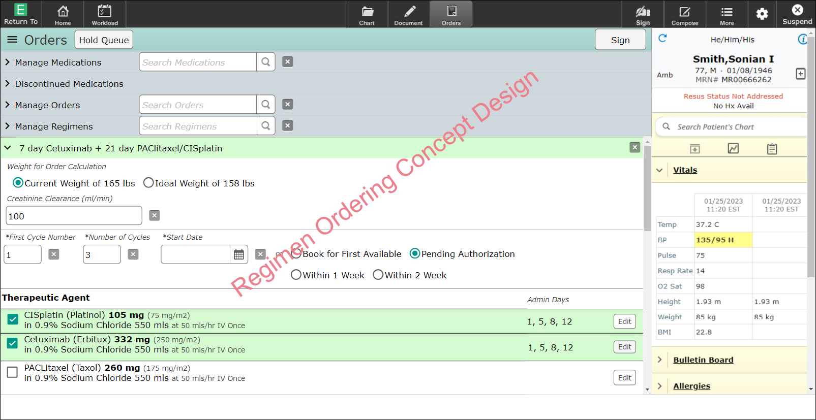
Providers had no reliable way to order all components of a regimen together. If a patient required a unique variation, clinicians often had to manually assemble multiple treatment plans, introducing risk and slowing down care.
Regimens are inherently complex. They span multiple days, include different administration routes (IV, oral), rely on dependencies like fluids and additives, and often require patient-specific dose calculations.
Clinicians struggled with:
Adjusting doses for specific days or cycles
Recalculating dosing based on body surface area (BSA) without introducing errors
Substituting medications or fluids mid-treatment
Previewing outcomes before signing the orders
Making changes without having to rebuild the entire regimen
Key feedback from users:
“We just need a safe way to make changes without blowing up the entire plan.”
“Ordering wasn’t just too complex, it was brittle. One small change could force users to delete and rebuild the whole regimen. That’s not scalable or safe.” -

3. Discovery & Research: Finding the Cracks in the Workflow
To understand the full scope of the problem, I shadowed and interviewed:
Providers actively ordering multi-day regimens
Pharmacists responsible for building fluid combinations
Quality assurance reviewers validating live treatment cycles
Through this research, I identified several critical gaps:
Providers had to navigate multiple screens and applications to do their tasks.
No interface patterns to support dose variation by day or per patient
No support for substitutions or in-progress regimen edits
Unclear communication when doses were modified mid-cycle, leading to confusion and risk
Key insight
“It became clear that ordering wasn’t a single task. It was a fluid process. Clinicians needed the flexibility to respond to patient conditions and treatment delays without losing control of the regimen.”
-

4. Strategy & Information Architecture: Structuring the UI Around Regimen Logic, Not Forms
Designing for real-world flexibility
I replaced rigid, static forms with modular, per-day order groupings that better reflected how clinicians think and work. Orders were grouped by:
Route (IV, oral, supportive medications)
Sequence (hydration, chemotherapy, recovery medications)
I introduced new UI states to support the dynamic nature of treatment:
"Edit this day only"
"Apply to all future cycles"
We also built in flexible logic to support:
Re-entering BSA (body surface area) values mid-treatment
Substituting fluid carriers without affecting the entire regimen
Implementing rescue dosing based on patient response
“I designed the architecture to reflect how regimens behave over time, not just what they contain on paper. Every interaction needed to respect the underlying treatment logic.”
-

5. Interaction Design & UI Contributions: Building Interactive Patterns That Match Real Scenarios
Designing for clarity and control
To support safe and confident decision-making, we designed interface patterns that allowed users to:
Adjust doses per day using sliders or manual entry
Trigger real-time recalculations based on updated BSA values
Receive auto-suggested substitutions for equivalent fluids or supportive medications
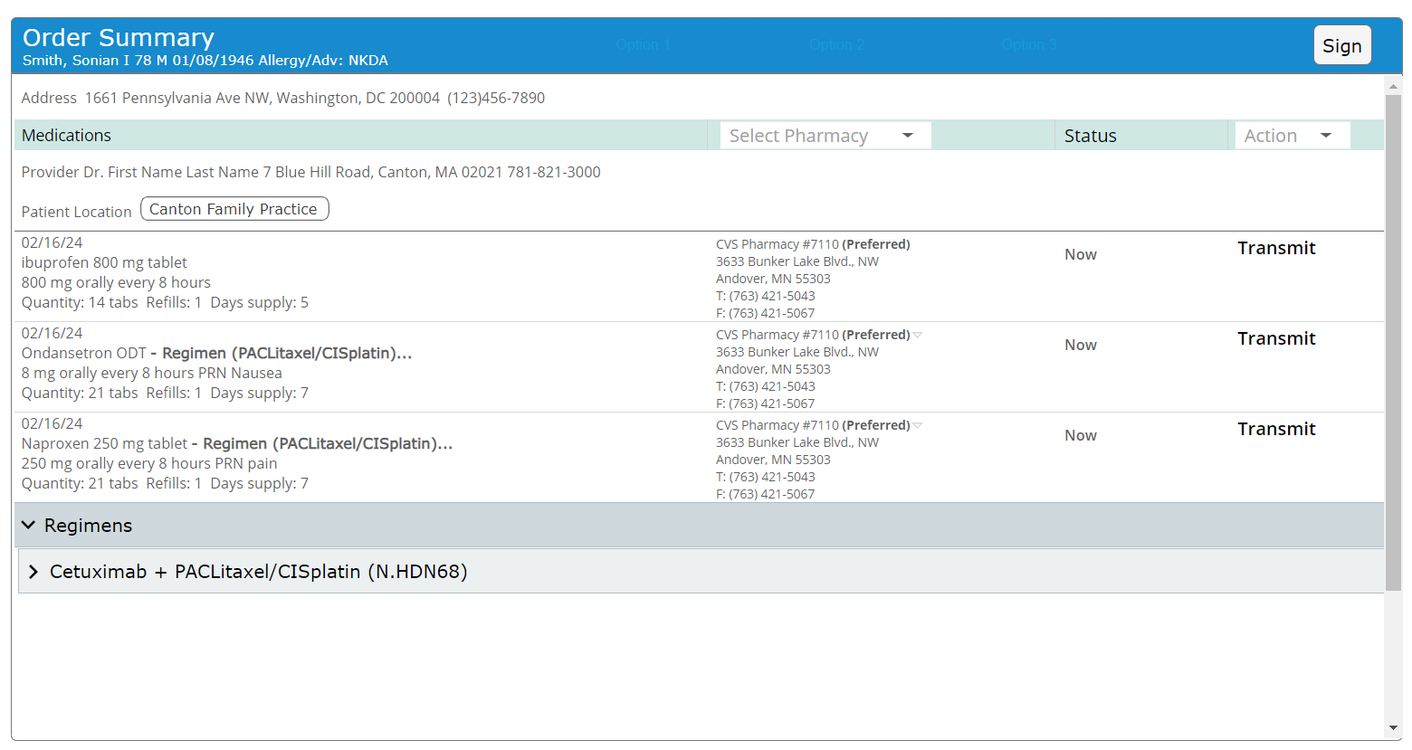
I also introduced a “Summary Before Submit” screen to give users a final checkpoint. It included:
High-visibility dose and timing details
Inline warnings, such as incompatible IV string volumes
A clear day-by-day preview of all orders
“The core UX challenge wasn’t just showing data. It was helping users understand what would happen if they made a change. That required responsive, explanatory interaction design.”
-
6. Collaboration & Constraint Handling: Partnering Across Clinical and Technical Teams
Collaborating across teams to make it real
Our teams worked closely with developers, cross-application teams, oncologists, pharmacist, and ordering providers to:
Build safe defaults for fluid volume calculations
Support substitution logic without requiring users to restart the regimen
Handle BSA recalculations dynamically based on patient data
I partnered with pharmacists to:
Validate additive logic and timing after edits
Preserve proper administration alignment, such as ensuring fluids run before chemotherapy
In parallel, I collaborated with QA and product teams to:
Maintain order validation logic across cycles
Ensure consistency between what users saw and what the system filed
“I drove alignment across siloed teams to ensure the system reflected both clinical logic and EHR constraints. Great design in this space required invisible coordination.”
-
7. Testing & Iteration: Testing With Real Users on Complex Cases
Testing with the people who live in this workflow
I conducted interactive prototype testing with:
High-volume adult oncology physicians
Pediatric clinicians managing highly variable BSA-based dosing
QA nurses responsible for validating real-world cycle edits
Focus scenarios included:
Editing the chemotherapy dose on cycle 3 only
Substituting fluids for a single day due to supply issues
Re-entering BSA after a patient’s weight changed
Key improvements after testing:
Made the screen show persistent highlights of recent changes
UI factors to more closely follow design conventions
Display the appropriate amount of details
Integrates preview into the begining stages of ordering
Added clear labeling to indicate the scope of changes (for example, “Cycle 2+”)
Streamlined the “Edit” interaction to reduce hesitation and errors
“Testing wasn’t just about task success. It was about building confidence. I paid attention to when people hesitated, not just when they clicked.”
-
8. Results & Impact: A Flexible, Safer Way to Order Oncology Treatments
Outcomes
Enabled dose adjustments without requiring users to reset or rebuild regimens
Reduced ordering time for common treatment plans by 15 percent
Allow edits to flow between applications
Allow for patient to be treated at any location without additional workarounds
Improved communication and alignment between prescribers and pharmacists
Product adoption
Rolled out as the standard preview experience across all oncology treatment plans
Established the foundation for upcoming acute-focused regimen enhancements
User feedback
“Now we can adapt treatment without starting over, that’s a huge win.”
Reflection
“By combining flexible editing with clear guardrails and real-time previews, we created a system that clinicians trust even under pressure.”
-
9. Reflection & Growth: What I Took Away as a Designer
1. Ambiguity is an invitation to lead
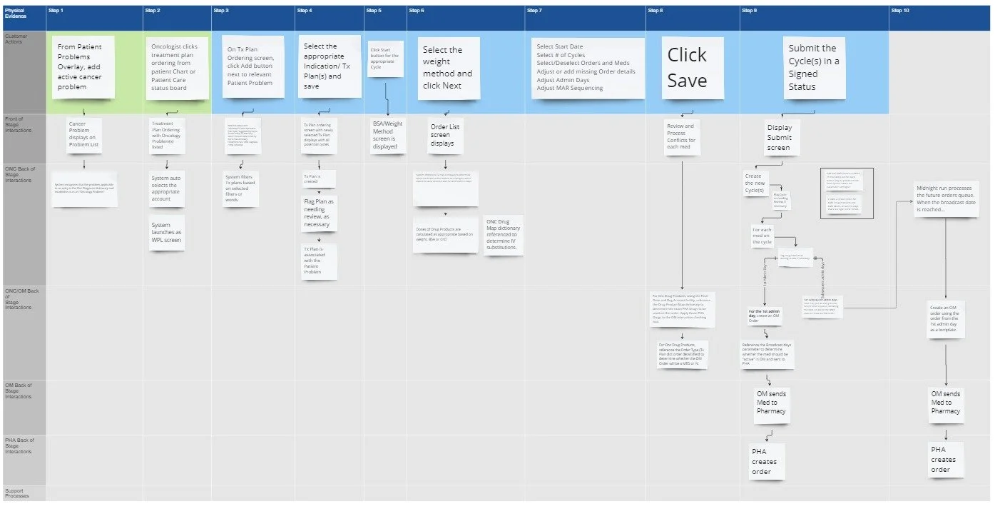
There was no established guidance for how regimen preview during ordering should work across users and workflows. I stepped in to lead discovery, working directly with clinical subject matter experts and engineering partners. Together, we defined safety rules, mapped decision logic, and shaped new UI patterns to make the system reliable and trustworthy.“There were no existing rules for how to do this safely. I worked with clinical SMEs and engineering to define them, both in logic and in pixels.”
2. Time is part of the workflow
This project challenged me to design not just for tasks, but across time. Cycles, substitutions, dose adjustments, and weight-based changes required me to think in systems. Designing across treatment timelines meant every interaction had to account for clinical progression, not just screen state.“Designing across time such as cycles, delays, and substitutions pushed me to think in systems, not just screens.”
3. Great UX makes change feel safe
Clinicians know how to order medications. What they struggle with is editing without breaking the plan. I focused on progressive disclosure, scope labeling, undo patterns, and decision previews to reduce the fear of mistakes and give users confidence at every step.“Most clinicians don’t need help placing orders. They need help making changes without breaking the plan. That is where UX can shine.”
4. Trust is the true success metric
Every decision in this project was about one thing: creating a sense of clarity and safety. From system architecture to button labeling, I asked: will the user trust what they see? Will they feel safe acting on it? I saw trust as both a design outcome and a clinical requirement.“Every user interaction came down to one question. Can I trust what I’m seeing, and can I act on it safely?”
5. Outcomes depend on cross-functional alignment
This project taught me that even the best design ideas mean little without buy-in and coordination. I worked across product, dev, pharmacy, nursing, QA, and compliance to ensure the experience not only met user needs, but could be built, filed correctly, and scaled. Design was the connector across silos.“Biggest impact was to drive alignment across siloed teams to ensure the system reflected both clinical logic and EHR constraints. Great design in this space required large amount of coordination.”
